
How Large Should Artwork Be Above a Sofa or Credenza?
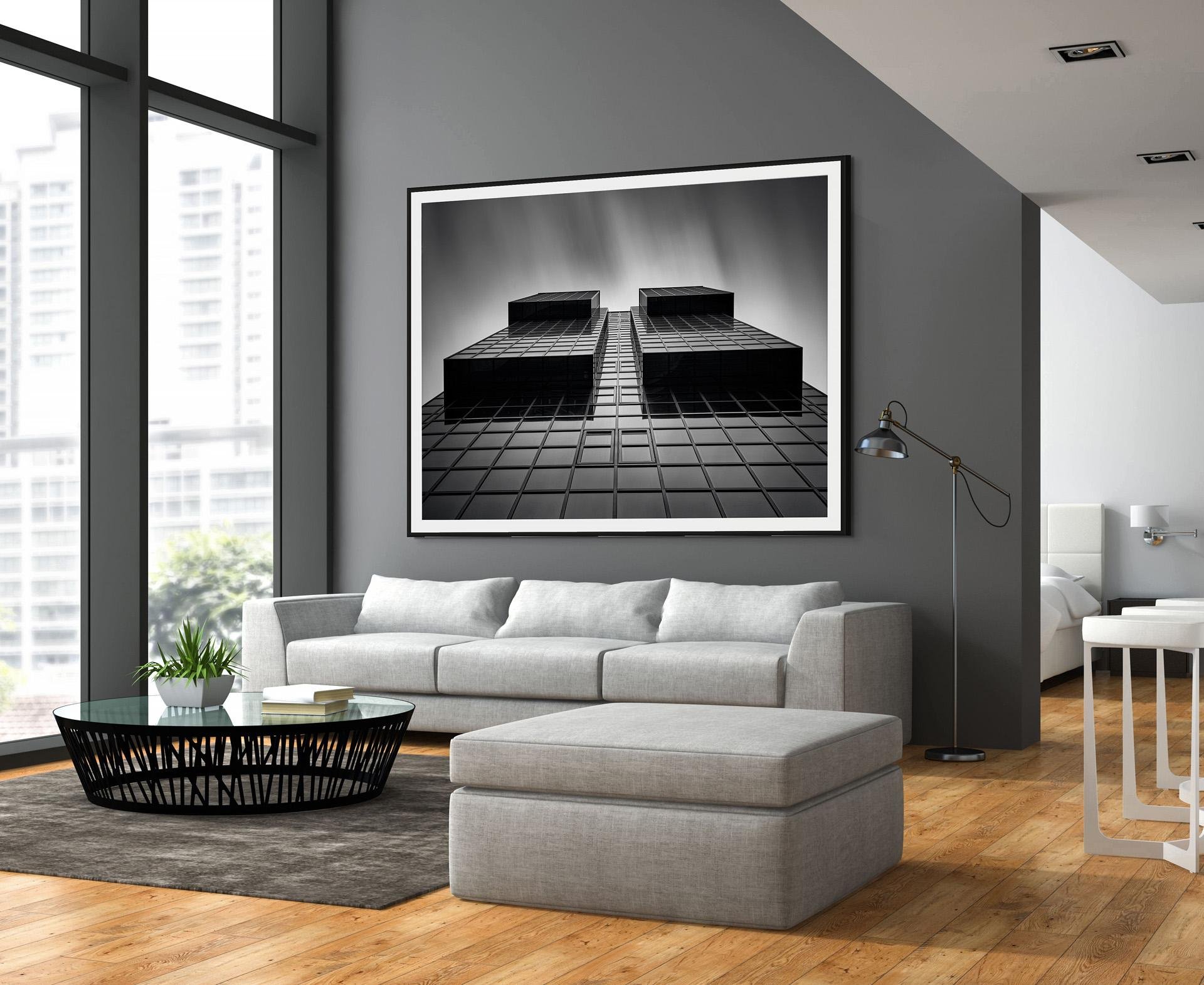
One of the most common decorating mistakes isn't choosing the wrong artwork—it's choosing the wrong size.
A beautiful photograph or painting can lose its impact if it's too small for the wall or too large for the furniture beneath it. The good news is that professional designers follow a few simple guidelines that almost always produce a balanced, sophisticated result.
The 60–75% Rule
A good rule of thumb is that artwork should be approximately 60–75% of the width of the sofa, credenza, console, or bed below it.
For example:
72-inch sofa: Artwork should be about 43–54 inches wide.
84-inch sofa: Artwork should be about 50–63 inches wide.
96-inch credenza: Artwork should be about 58–72 inches wide.
This doesn't have to be one large piece. A diptych, triptych, or a carefully arranged gallery grouping can work equally well, provided the overall arrangement falls within this range.
Leave Some Breathing Room
Artwork should usually hang 6–10 inches above the furniture.
If it's much higher, the artwork begins to feel disconnected from the room. The goal is to make the furniture and artwork feel like one unified composition rather than two separate elements.
Bigger Is Often Better
People frequently underestimate how large artwork should be.
A piece that looks substantial in a gallery can seem surprisingly small once it's hanging on a large wall. Modern interiors—with their open floor plans, high ceilings, and clean architectural lines—often benefit from larger artwork that makes a confident statement.
When in doubt, choose the larger option.
Black-and-White Photography in Modern Interiors
Large-format black-and-white architectural photography works particularly well above sofas and credenzas because it provides visual impact without overwhelming the space.
The clean lines, strong geometry, and restrained palette complement contemporary interiors while adding texture, depth, and a sense of sophistication. Rather than competing with furnishings, monochrome photography often helps unify the room.
Single Image or Multiple Pieces?
Both approaches can work.
A single large photograph creates a dramatic focal point and emphasizes simplicity.
Multiple pieces can add rhythm and visual interest, especially when they share a common theme or style. Keep the spacing between pieces relatively tight—typically 2–3 inches—so they read as one cohesive installation.
Consider Viewing Distance
Large artwork is meant to be viewed from across the room.
If your seating area is 10–15 feet from the wall, don't be afraid to choose larger prints. Architectural photography, in particular, reveals new details as viewers move closer while maintaining a strong graphic presence from a distance.
Final Thoughts
Choosing the right size is just as important as choosing the right image.
Artwork that is properly scaled creates harmony, anchors the furniture, and makes the entire room feel professionally designed.
Whether you're furnishing a contemporary home, a corporate office, or a hospitality space, generous proportions almost always create the strongest visual impact. A thoughtfully sized black-and-white architectural photograph can transform an ordinary wall into the defining feature of the room.
