
How Black-and-White Architectural Photography Works in Modern Interiors
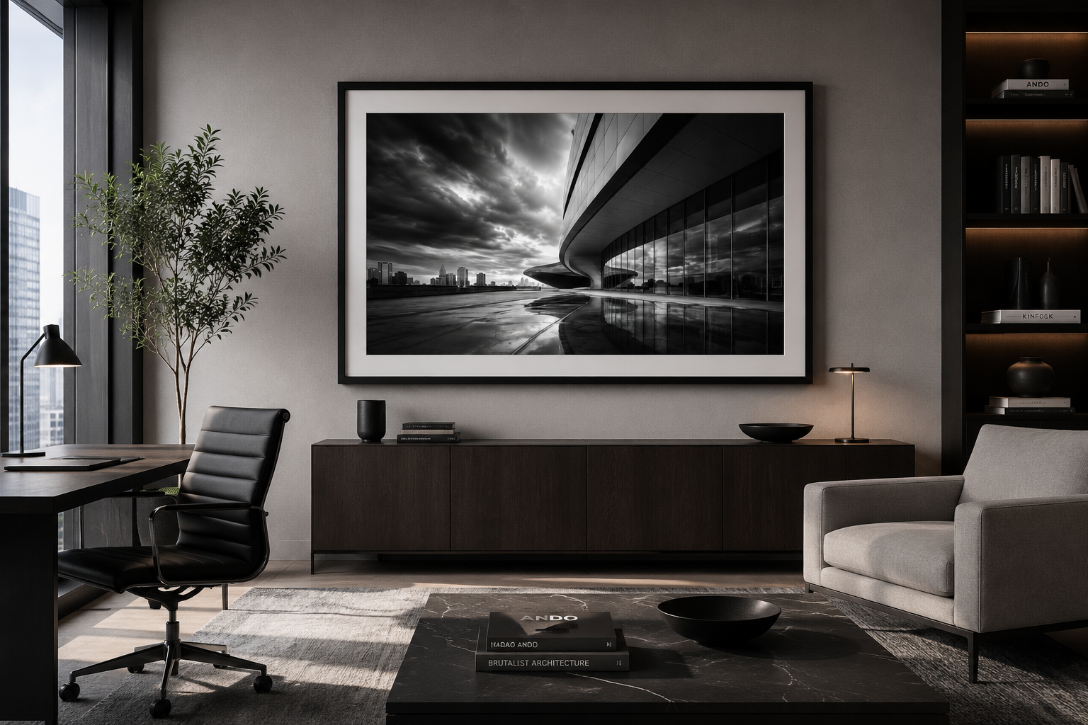
Modern interiors are often built around clean lines, open space, restrained color palettes, and carefully chosen materials. Black-and-white architectural photography works naturally in these environments because it shares the same visual language.
Rather than competing with a room, it reinforces structure, rhythm, balance, and contrast.
It complements the architecture of the room
Architectural photography is already concerned with many of the same elements that define a well-designed interior: proportion, geometry, repetition, texture, light, and space.
When the photograph is displayed in a modern room, those elements can echo the surrounding environment. A photograph of repeating windows may relate to shelving or wall panels. A sweeping curve may connect visually with furniture, lighting, or architectural details. Strong vertical and horizontal lines can give a room a greater sense of order.
The artwork becomes part of the design rather than an unrelated object placed on the wall.
Black and white does not compete with the color palette
Color can be powerful, but it can also be restrictive. A vividly colored photograph may work beautifully in one room and feel out of place in another.
Black-and-white photography is more adaptable. It can work with neutral interiors, warm woods, polished concrete, dark cabinetry, metallic finishes, and strong accent colors. Because it does not introduce another dominant hue, it allows the existing palette to remain intact.
This makes black-and-white architectural photography especially useful for designers working across offices, hospitality spaces, and contemporary residences.
It creates contrast without visual clutter
Modern interiors often depend on restraint. Too much visual information can make a room feel busy, particularly when the furnishings, finishes, and lighting are already carefully considered.
Black-and-white photography can add impact without creating clutter. Deep blacks, bright highlights, and controlled midtones bring visual presence to a wall while maintaining a disciplined appearance.
The strongest images often feel bold from a distance and reveal more subtle details when viewed closely.
It can make a space feel more sophisticated
Architectural photographs tend to suggest permanence, precision, and design awareness. They can give a room a more considered and professional character without feeling decorative in a conventional sense.
This is one reason the genre works well in executive offices, conference rooms, reception areas, hotels, and other spaces where the environment is intended to communicate confidence and refinement.
The subject matter also matters. A dramatic façade, abstract structural detail, quiet corridor, or carefully framed urban scene can establish a distinct mood without relying on literal storytelling.
Scale is especially important
Architectural photographs often benefit from being displayed at a substantial size. Large prints allow lines, shapes, textures, and tonal transitions to become more immersive.
In a conference room or lobby, one large image may be more effective than several smaller works. In a hallway, hotel room, or residential setting, a coordinated pair or group may create rhythm across the wall.
The correct size depends on the room, the wall, and the viewing distance, but modern interiors usually reward confident scale. Artwork that is too small can feel incidental, while a properly scaled photograph can help anchor the entire space.
Framing changes the effect
The presentation should support both the photograph and the room.
A narrow black frame can emphasize contrast and structure. A white mat can create breathing room around a highly detailed image. Metal and acrylic presentations can produce a cleaner, more contemporary appearance, while a traditional framed print may feel more appropriate in a transitional interior.
The best choice is usually the one that allows the photograph to feel integrated with the surrounding materials and furnishings.
The image should support the mood of the space
Not every architectural photograph creates the same effect.
A high-contrast image with strong geometry may energize a lobby or conference room. A quieter, more minimal photograph may be better suited to a hotel room, private office, or residential interior. Repeating forms can create order, while sweeping curves and dramatic shadows can introduce movement.
The photograph should contribute to the atmosphere the space is intended to create.
More than decoration
Black-and-white architectural photography works in modern interiors because it does more than fill an empty wall.
It can reinforce the room’s architecture, preserve the color palette, introduce contrast, and establish a sense of scale and visual identity. At its best, the artwork feels inseparable from the space around it.
That is what makes it particularly effective in contemporary interiors: it is both expressive and restrained.
Suggested excerpt
Black-and-white architectural photography complements modern interiors by reinforcing line, geometry, contrast, scale, and visual order without competing with the room’s existing color palette.
Suggested SEO title
How Black-and-White Architectural Photography Works in Modern Interiors
Suggested SEO description
Discover why black-and-white architectural photography works so well in modern homes, offices, hospitality spaces, and contemporary interiors.
